
In today’s digital age, having a responsive website is crucial. It ensures your site looks great on any device.
From desktops to smartphones, users expect seamless experiences. Responsive website design meets this demand.
Mobile optimization is no longer optional. More than half of web traffic comes from mobile devices.
Google rewards mobile-friendly sites with higher search rankings. This makes responsive design vital for SEO success.
Responsive web development uses flexible grids and layouts. It adapts to different screen sizes effortlessly.
Businesses benefit from increased engagement and conversions. A wider audience can access their content.
Responsive design is a smart investment. It saves time and resources by eliminating the need for separate site versions.
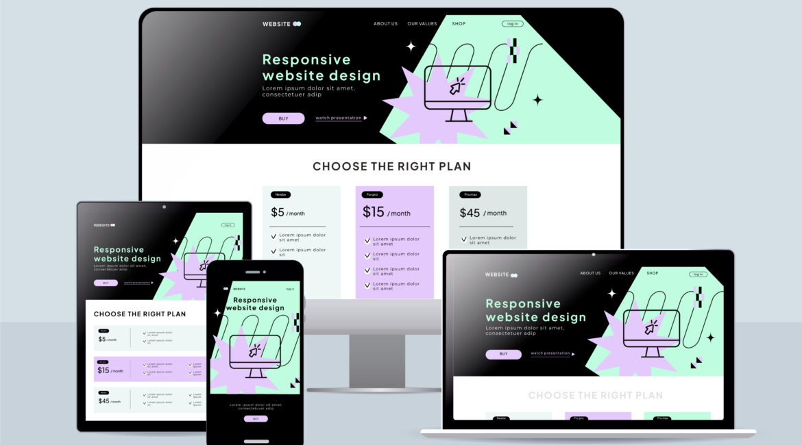
What Is Responsive Website Design?
Responsive website design is an approach that ensures a website looks good on any device. It adjusts layouts and content automatically based on the screen size.
In responsive design, a single website version serves all devices. There’s no need to create separate mobile and desktop versions. This unified design simplifies management and maintenance.
Key features of responsive design include:
- Fluid grids
- Flexible images
- Media queries
These elements enable the website to fit any screen seamlessly. The design employs CSS to achieve this flexibility.
Developers use breakpoints in the design process. Breakpoints determine how the layout changes at different screen sizes.
This approach allows users to enjoy a consistent experience, regardless of their device. It enhances usability and keeps users engaged. Consequently, businesses can maintain their audience’s interest across all platforms.
Overall, responsive design caters to the growing variety of devices. It ensures that users always have an optimal viewing experience.
Why Responsive Design Matters in Today’s Digital World
In today’s digital era, users access the web through diverse devices. Smartphones, tablets, and desktops all play a role. Each of these devices presents content differently.
Responsive design is crucial for reaching a broad audience. Statistics show over half of web traffic comes from mobile devices. Ignoring mobile users risks losing potential customers.
Google values mobile-friendly sites. It prioritizes them in search rankings. Therefore, responsive design boosts visibility in search engines.
The demand for smooth, consistent user experiences is high. Users expect sites to load quickly and function seamlessly. Slow or clunky sites lead to high bounce rates.
Important aspects to consider include:
- Cross-device accessibility
- User retention strategies
- SEO benefits
Businesses must adapt to these expectations. Failing to do so can result in losing ground to competitors. Embracing responsive design is key.
Brands that invest in responsive design gain trust and loyalty. They provide users with what they seek-efficiency and convenience.
The Role of Mobile Optimization in Modern Web Development
Mobile optimization is a cornerstone of today’s web development. With more users accessing sites via mobile devices, it’s essential. This shift demands websites that adapt seamlessly to small screens.
Websites that fail mobile optimization often see high bounce rates. Mobile users expect fast, easy-to-navigate experiences. If a site lacks these qualities, visitors leave swiftly.
Key elements of mobile optimization include:
- Speedy loading times
- Intuitive touch navigation
- Consistent visual appeal
The design needs to be intuitive, acknowledging how people use their phones. Easy scrolling and touch-friendly buttons are vital. If navigation is cumbersome, users won’t stay.
Additionally, well-optimized mobile sites contribute to better search rankings. Google measures how mobile-friendly a website is. This metric greatly impacts its visibility in search results.
Investing in mobile optimization ensures a better user experience. It also secures a competitive edge in the online marketplace.
Key Benefits of Responsive Website Design
Responsive website design offers numerous advantages for businesses. It provides a consistent experience across all devices, boosting user satisfaction. This consistency helps in building trust with your audience.
One major benefit is increased reach and engagement. Responsive sites accommodate users regardless of device, expanding potential customer bases.
Improved conversion rates result from the design’s cross-device compatibility. When users can easily navigate a site, they are more likely to convert.
Here are some key benefits:
- Boosts user engagement
- Improves conversion rates
- Reduces maintenance needs
Responsive design also simplifies website maintenance. Developers and designers can focus on a single version, saving time and resources. This unified approach makes updates more efficient.
Moreover, responsive design prepares a site for future devices and screen sizes. As technology evolves, your website remains accessible.
Businesses adopting responsive design generally see lower bounce rates. Users are less likely to leave if a site is easy to use. These benefits underscore the need for responsive website development.
Enhanced User Experience Across Devices
User experience is pivotal to online success. Responsive design ensures uniformity, no matter the device. Users appreciate a seamless transition between their phone and desktop.
This design fosters easy navigation and readability. Users shouldn’t struggle to find information or read content. The layout adapts, presenting the most important elements clearly.
A positive experience enhances brand perception. When users can trust a site to work on any device, loyalty grows. They return, knowing what to expect.
Optimized user experiences also lead to higher engagement. Happy users spend more time exploring a site.
SEO Advantages of Responsive Web Development
Responsive design is crucial for SEO. Search engines favor websites with fluid layouts, ranking them higher. Google, for instance, indexes mobile-friendly sites above others.
Here’s why it impacts search rankings:
- Mobile-first indexing prioritizes responsive sites
- Less duplicate content consolidates SEO efforts
- Faster loading enhances crawl efficiency
Mobile-first indexing means Google primarily looks at mobile versions of content. A responsive site streamlines this process.
Moreover, it reduces the need for duplicate content. Instead of multiple site versions, there’s one, boosting SEO.
Finally, faster page speeds enhance your site’s crawl efficiency. Search engines can index content more efficiently, improving rankings.
A well-designed responsive site is key in today’s digital landscape.
Cost Efficiency and Simplified Maintenance
Responsive design can save money in the long run. It eliminates the need for multiple site versions. Maintaining a single site is simpler and more cost-effective.
Here’s how responsive sites cut costs:
- Fewer resources needed for development
- Single-site management lowers maintenance expenses
- Easier updates across all platforms
With fewer resources needed, the initial investment pays off over time. Teams maintain one site, reducing the overall workload.
Besides, updates are more straightforward. Changes are automatically applied across all devices. This efficiency translates to cost savings in management and operation.
Responsive design not only boosts user satisfaction but also keeps expenses in check. It’s a smart choice for modern businesses looking to streamline web operations.
Core Elements of Responsive Web Development
Responsive web development relies on certain core components to function effectively. These elements ensure adaptability and flexibility across various devices.
One crucial aspect is using flexible grids and layouts. These enable content to adjust seamlessly to different screen sizes.
Key to responsive design are media queries and breakpoints. These allow developers to apply specific styles based on device characteristics.
Responsive images and media are also vital. They ensure that images load appropriately, saving bandwidth and enhancing performance.
Here’s a breakdown of essential elements:
- Flexible grids and layouts
- Media queries and breakpoints
- Responsive images and media
Together, these components form the backbone of responsive web development. They ensure that websites remain effective and user-friendly across all platforms. Implementing these elements is critical in creating a modern website experience.
Flexible Grids and Layouts
Flexible grids and layouts form the foundation of responsive design. They enable content to resize proportionately, improving fluidity.
This approach leverages percentages rather than fixed units. As a result, elements resize in relation to the screen.
An adaptive grid allows for a coherent structure. It maintains visual consistency without compromising usability.
Media Queries and Breakpoints
Media queries are CSS techniques that enable design versatility. They help developers customize layouts for specific devices.
Breakpoints are the points where layout changes occur, tailored to screen dimensions. By using these, designs adapt as necessary.
Key functions of media queries include:
- Detecting device characteristics
- Applying specific styles
- Creating responsive breakpoints
Responsive Images and Media
Responsive images enhance website performance. They adjust size and quality based on the device, ensuring faster load times.
This technique helps conserve resources while maintaining visual quality. Users enjoy a seamless experience, regardless of device used.
Formats like SVG or JPEG 2000 are commonly used. These formats optimize resolution for screens, boosting speed.
Responsive media extends to videos and other multimedia. These elements, when optimized, contribute significantly to a streamlined website experience. They ensure content is appealing across all platforms.
Common Challenges and Mistakes in Responsive Design
Responsive design presents several challenges for developers. These issues often stem from a lack of planning or understanding of user needs.
One common mistake is neglecting testing across all devices. A site may work well on desktops but fail on smaller screens.
Designers sometimes overload websites with excessive content. This can slow down load times and hinder user experience.
Key mistakes include:
- Inadequate device testing
- Overlooking mobile-first design
- Ignoring load speed optimization
Responsive design requires careful consideration of details. Developers need to balance visual appeal and functionality across devices. Failure to do so can lead to dissatisfied users and lost traffic. Effective planning and thorough testing can help alleviate these issues.

by Tai Bui (https://unsplash.com/@agforl24)
Best Practices for Implementing Responsive Design
Implementing responsive design requires strategic planning and execution. Focus on user experience by ensuring ease of navigation across all devices. Start with a mobile-first approach, which can guide your design decisions effectively.
Next, optimize images to enhance load speed and performance. Use image formats that adjust to varying screen sizes without losing quality. This approach helps maintain fast loading times, improving user retention.
Create content with flexibility and accessibility in mind. Prioritize essential information to ensure clarity on smaller screens. Avoid clutter by embracing simplicity and consistency in your design elements.
Key practices include:
- Prioritizing mobile-first design
- Optimizing images for performance
- Ensuring content clarity and accessibility
Testing is crucial. Regularly check functionality and appearance across multiple devices. This ongoing evaluation helps identify potential issues early, ensuring a seamless experience for users.
Testing and Maintaining a Responsive Website
Ensuring your website remains responsive requires regular testing. Employ various tools to monitor how it performs across different devices and screen sizes. This proactive approach helps catch issues early.
Continuous maintenance is essential to adapt to technological advances. Regular updates ensure your site remains modern and compatible. Keep an eye out for trends that may impact design norms.
Key aspects to monitor during testing and maintenance:
- Device compatibility
- Loading speed
- User interface consistency
Also, consider user feedback as a critical component. Insights from visitors can reveal areas for improvement. Adjustments based on user experience can enhance your website’s overall effectiveness.
The Future of Responsive Web Development
The landscape of web development is ever-evolving. As technology advances, responsive design must adapt to new devices and screen formats. Developers will increasingly focus on innovative design techniques that cater to emerging technologies like foldable screens and augmented reality.
Automation and smarter design systems may also streamline how sites adapt across devices, helping teams create responsive experiences more efficiently. Staying ahead in this field requires continuous learning and adaptation.
How SEO Exchange Can Help With Mobile Websites
Building a responsive site is only part of the equation-your mobile experience should also support visibility and conversions. SEO Exchange is an SEO marketing agency that can help businesses improve mobile websites by aligning responsive web development with mobile-first SEO best practices.
This includes designing mobile-friendly calls to action (CTAs), implementing a floating tap-to-call button for faster lead capture, and using simple mobile forms that visitors can complete in seconds. Combined with technical SEO and performance improvements, these updates can help turn mobile traffic into real inquiries and sales.
Conclusion: Why Every Business Needs a Responsive Website
Responsive website design is not just a trend; it is a necessity for any business aiming to thrive online. With the majority of users accessing the web via mobile devices, providing a seamless experience is crucial.
Having a responsive website enhances user engagement and improves search engine rankings. Embracing this design approach helps businesses stay competitive, reach a broader audience, and ultimately drive growth and success.