
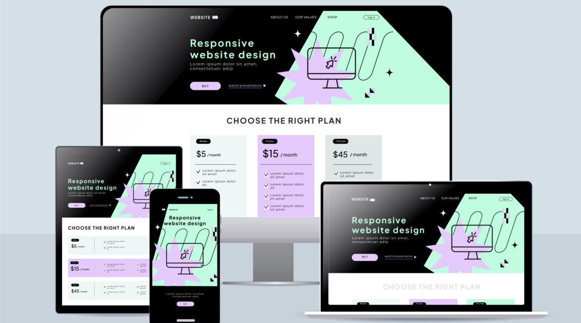
Your website should provide a strong experience whether someone visits from a computer, tablet, or phone. Responsive website design allows the layout to adjust automatically so your content remains easy to view and use on different screen sizes.
A website that works well on mobile devices can make a major difference in how visitors interact with your business. Pages should load properly, text should remain readable, and navigation should be simple without requiring users to constantly zoom or scroll.
Responsive design also plays a role in your overall SEO strategy. Search engines take mobile usability into consideration, making a mobile-friendly website an important part of maintaining a strong online presence.
Modern responsive web development uses flexible layouts that reorganize website elements as screen dimensions change. This allows images, menus, text, and other content to fit naturally across different devices.
A responsive site can also help businesses keep visitors engaged and make it easier for them to contact the company, explore services, or complete an inquiry. Since one website can adapt to multiple devices, it also makes ongoing website management more efficient.
What Is Responsive Website Design?
Responsive website design allows a website to adjust its appearance and layout according to the device being used. Rather than building one site for computers and another for phones, a responsive setup allows the same website to accommodate different screen dimensions.
This approach makes website management more straightforward while providing visitors with a consistent way to access your content. A responsive layout can rearrange page sections, resize images, adjust menus, and change spacing when the available screen width changes.
Several technical features make this possible:
- Flexible page layouts
- Scalable images and media
- CSS media queries
- Screen-size breakpoints
Together, these techniques allow website elements to respond to changes in screen dimensions. Developers can establish specific points where columns, navigation, text, and other components need to change their arrangement.
The goal is not simply to make a desktop website smaller. Each part of the page needs to remain functional and readable on a touchscreen as well as a larger display. Proper responsive development considers how visitors actually interact with the website on each type of device.

Lorem ipsum dolor sit amet, consectetur adipiscing elit. Ut elit tellus, luctus nec ullamcorper mattis, pulvinar dapibus leo.
